Truva · 2024–Present
Home buying,
redesigned

Buyers were dropping off before they ever saw a property. Truva had an exceptional service and an average product.
A funded startup with
₹300Cr+ sold - and a product that needed to match.
Series A
$9M
Raised


200+ Families who found their home on Truva


₹300Cr+ Worth of homes sold through the platform


85 NPS score
Great service
The product needed to earn trust at a level most apps
never have to think about. Every screen carries financial weight.


Users were leaving before they saw a
single property.
Trust wasn't established fast enough.
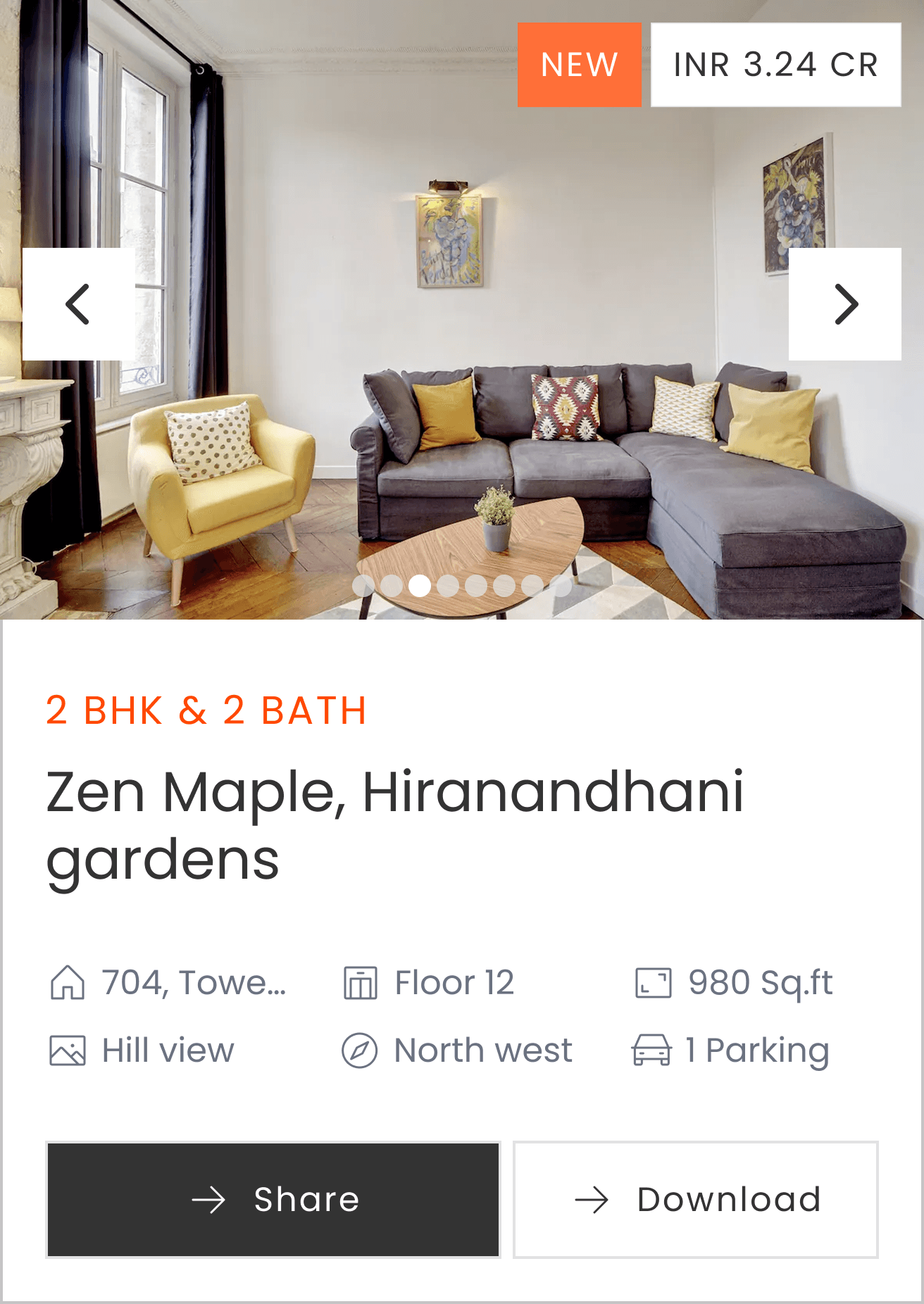
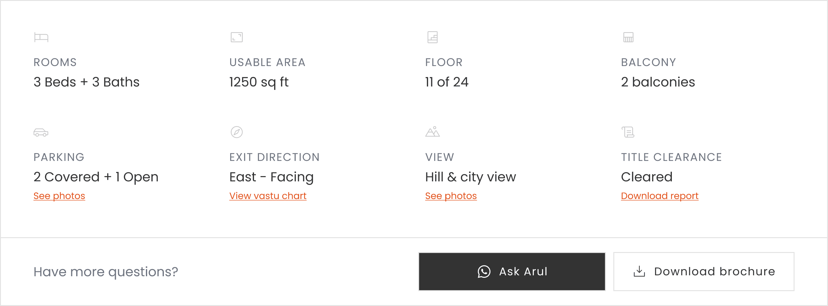
For a ₹2-17Cr purchase, buyers needed to feel safe in seconds.
The homepage wasn't doing that.


Differentiators were buried.
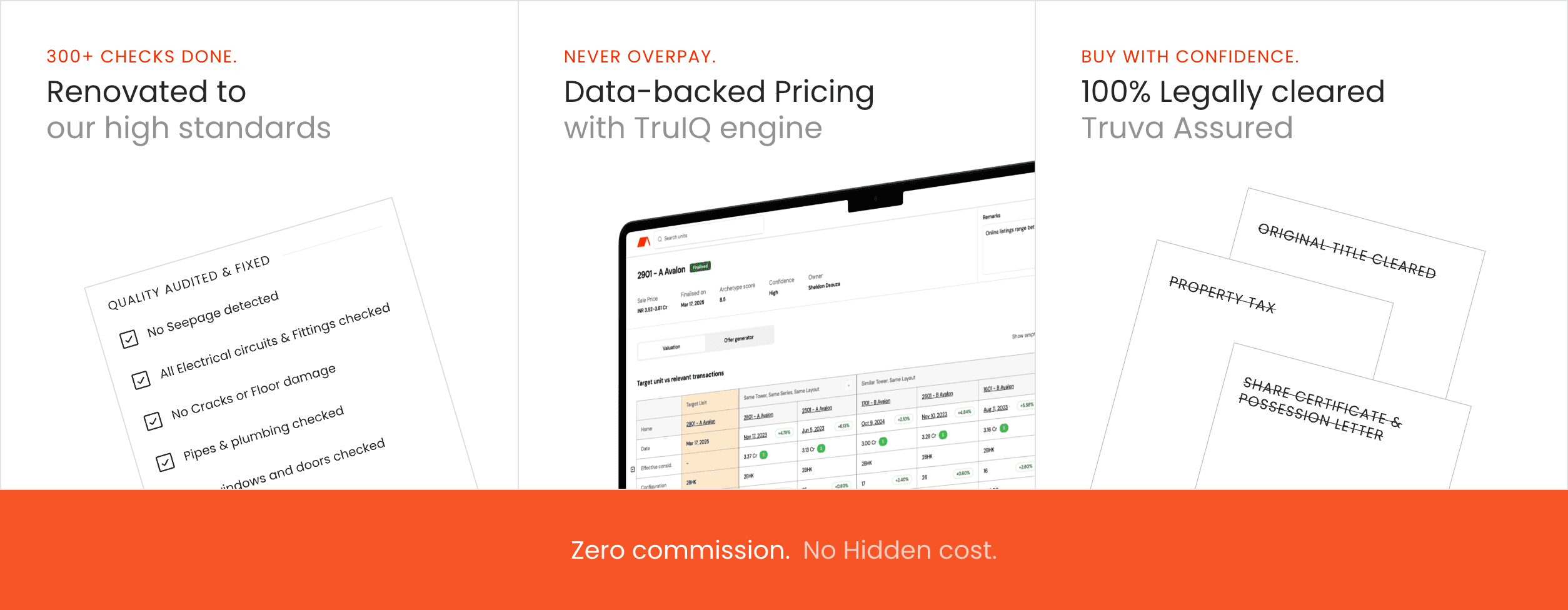
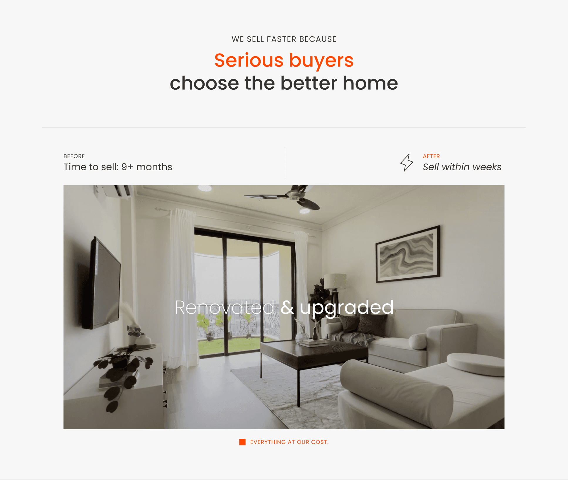
Renovated homes, no commissions, legally cleared - these were Truva's moat. The design wasn't surfacing them.
40% drop-off before the listing page.
The most valuable screen in the product - where buyers actually see homes - most users never reached it.

40% Drop off
Two research streams ran in parallel, quantitative funnel analysis on existing traffic and qualitative interviews with recent buyers and drop-offs.
Audited
6 Portals


12 sessions
12 moderated sessions with first-time Mumbai buyers. Common theme: Truva looked generic. The premium curation - the actual product - was invisible at first glance.
These are the three that shaped the product most

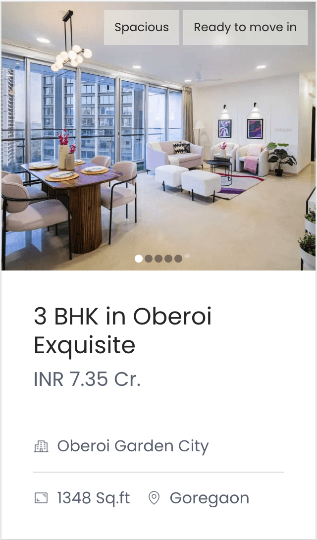
Lead with real homes,
not a search bar


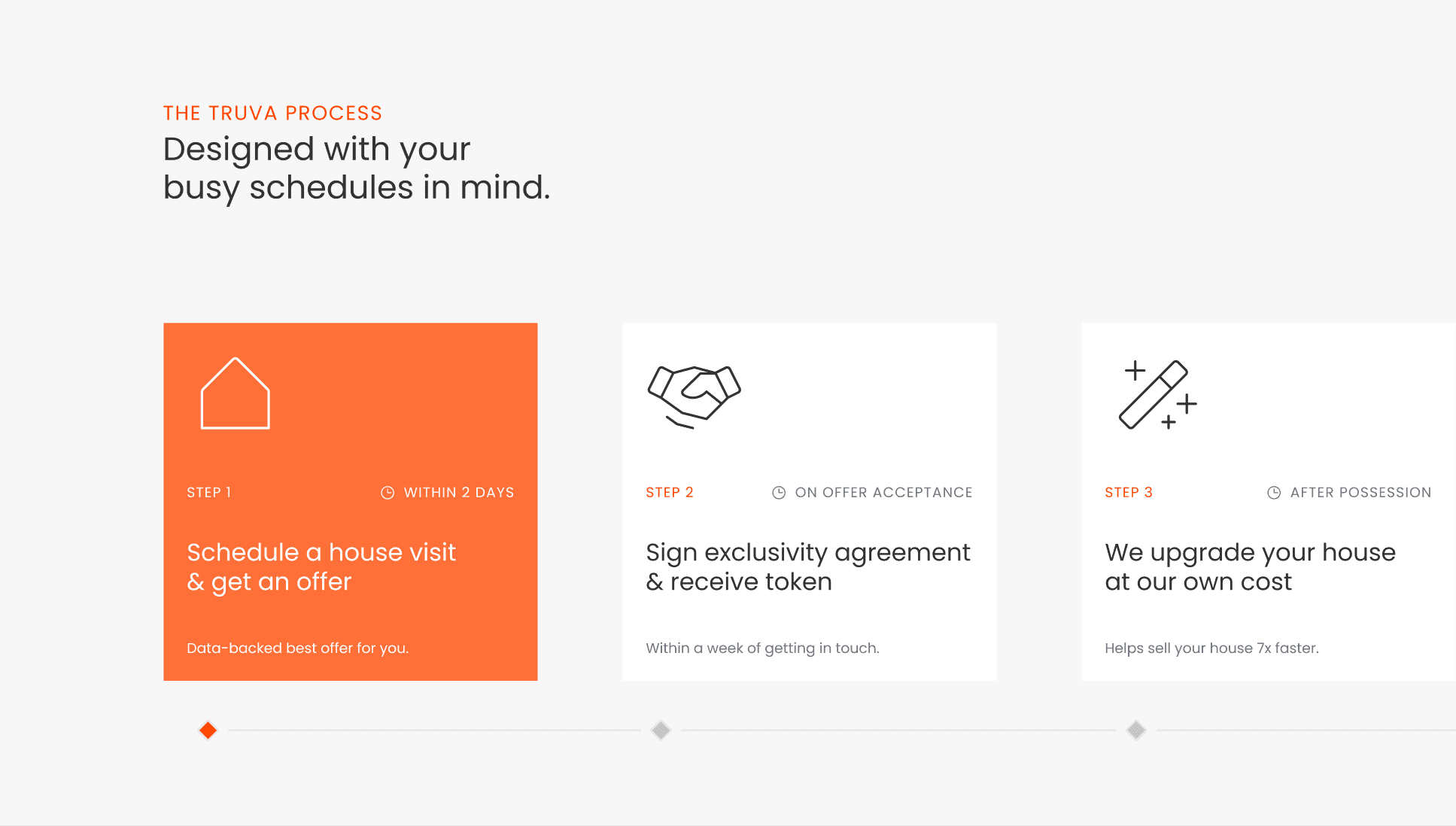
Seller flow:
process before the form


Emotional labels over
spec labels on cards